New in Quick Font Creator: Auto Hint, Auto Kern, and Auto Spacing
Handwriting fonts have a personality problem that most type designers never face: every glyph is drawn by hand, at a different size, at a slightly different angle. The shapes look great individually, but once they are compiled into a font file, small text can turn muddy, and some letter pairs crowd each other.
Our latest update adds three build-time refinements that clean this up automatically — Auto Hint, Auto Kern, and Auto Spacing. Each one is a per-font option in Font Settings, and all three can now be toggled in one tap from the font preview screen.
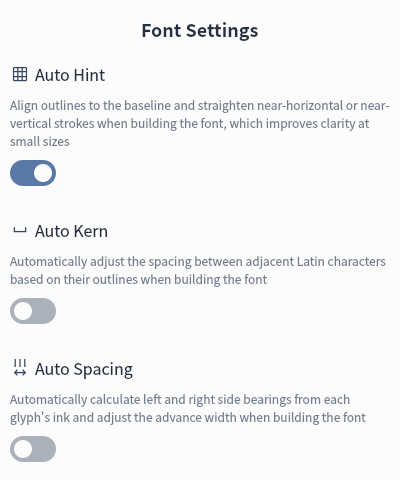
Auto Hint — on by default
Auto Hint fine-tunes every outline as the font is built:
- points that sit almost exactly on the baseline are snapped to it;
- strokes that are almost horizontal or vertical are straightened to be exactly horizontal or vertical.
The goal is simple: cleaner edges and more consistent stems, which makes your handwriting much easier to read at small sizes. The correction is deliberately small (within a fraction of a percent of the em square), so the character of your handwriting is preserved.
Caveat: because points are snapped, very subtle wobble in near-straight strokes may disappear. If you want every hand-drawn imperfection kept exactly as drawn, turn it off.
Auto Kern — off by default
Auto Kern adds a real kern table to the generated font. For every pair of printable Latin characters, it measures the horizontal gap between the right edge of the first glyph and the left edge of the second, then nudges the pair toward a comfortable target gap.
The result is tighter, more even Latin typesetting — think AV, To, or Wa — without hand-editing pairs.
Caveat: kerning is based on outline geometry, so a few pairs may feel slightly cramped. Adjustments are capped, and the feature is opt-in, so nothing changes unless you enable it.
Auto Spacing — off by default
Auto Spacing recalculates side bearings for each proportionally spaced glyph:
- the ink bounds are measured;
- a consistent side bearing is added on the left and right;
- the advance width is recalculated from ink width plus both bearings.
Instead of inheriting the exact box you drew in, every Latin glyph gets an even amount of breathing room, which produces more regular spacing across a whole line of text.
Caveat: glyphs may shift horizontally relative to your original drawing, and full-width characters such as CJK are left untouched.
One-tap toggles while you preview
The three options are also available directly above the preview, as three icon toggles:

From left to right: Auto Hint, Auto Kern, and Auto Spacing. A highlighted background means the option is on. Tap any icon to flip it — the setting is saved for the current font, a short toast confirms the change, and the font is rebuilt immediately so you can see the difference in the preview.
Defaults at a glance
| Option | Default | What it affects |
|---|---|---|
| Auto Hint | On | Outline alignment, baseline snapping, stroke straightening |
| Auto Kern | Off | Kerning pairs for printable Latin characters |
| Auto Spacing | Off | Side bearings and advance widths of half-width glyphs |
All three are saved per font, so you can use different settings for different handwriting styles. The same options also live in Font Settings if you prefer to configure them before building.